What do you think?
2 Likes
Easy on the eye. I like it.
The only thing that I might suggest is changing the font of either the “U” or the “Unbroken vTC” to match. A graphic design friend of mine used to always rant about using multiple fonts within a logo or sign.
1 Like
My response was going to be “aren’t they the same, just in the circle italic”, but on a second look, you are correct. Very similar, but not the same - you can tell from the curves (or lack of) at the bottom of the “U”.
Agree Colin. I spend a lot day looking at and making artwork comments and feedback.
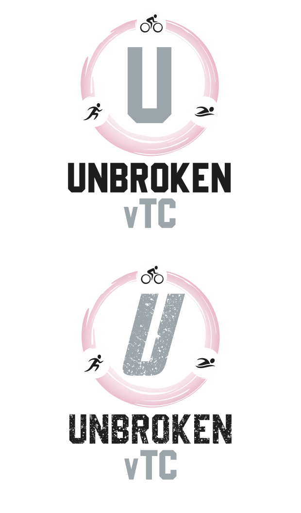
I quite like the second of those two pav
My preference is the second of the two with the scatter/distressed pattern through the text.
The angle font for the U in the roundel on the first doesn’t work for me. Adding the distressed look to both the main text and the U softens the appearance of the main text and helps pull the two parts together as one. That said I’m still not keen on mixing similar font types.
Another vote for the second one with the speckled lettering, inclined to agree with @kevstorr about mixing fonts though.
1 Like